The <dt-form-field> is a component that wraps form input components like
dtInput and provides functionality for a label (<dt-label>), errors
(<dt-error>) and hints (<dt-hint>).
<dt-form-field>
  <dt-label>Some text</dt-label>
  <input type="text" dtInput placeholder="Please insert text" />
</dt-form-field>
Imports
You have to import the DtFormFieldModule when you want to use the
dt-form-field. The dt-form-field component also requires Angular's
BrowserAnimationsModule for animations. For more details on this see
Step 2: Animations
in the getting started guide.
Because <dt-form-field> wraps a form input component, make sure that you also
have imported the specific component module (e.g. DtInputModule).
@NgModule({
  imports: [BrowserAnimationsModule, DtFormFieldModule],
})
class MyModule {}
Compatible barista form-controls
The following barista form-controls are compatible with the form-field.
Custom form-control
To make your custom form-control compatible with the form-field, your control
needs to implement the
DtFormFieldControl
interface.
Note: Your custom form-control also needs to support ngModel. This can be
done by implementing the ControlValueAccessor interface shipped by the
@angular/forms package.
Label
A label can be applied by adding a <dt-label> element. <dt-form-field> takes
care of linking the label correctly to the form component by adding
for="input-id" and the correct ARIA-attributes.
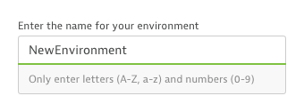
Hint labels
Hint labels are additional descriptive text that appears below the form field. A
hint is usually used to provide information that the user should know
independent from their actions. A <dt-form-field> can have up to two hint
labels: one start-aligned and one end-aligned.
<dt-form-field>
  <input
    type="text"
    dtInput
    placeholder="Please insert text"
    aria-label="Please insert text"
  />
  <dt-hint>Left hint</dt-hint>
  <dt-hint align="end">Right hint</dt-hint>
</dt-form-field>
Hint labels can be added with the <dt-hint> element inside the form field.
Hints can be added to either side by setting the align property on <dt-hint>
to either start or end. Attempting to add multiple hints to the same side will
raise an error.
<dt-form-field> takes care of linking the hints correctly to the form
component.
Validation (live hints)
Live hints are used to provide feedback and suggestions immediately while users are typing. They are used to e.g. show users if the password they entered fulfills all requirements.
<dt-form-field>
  <input
    type="text"
    required
    dtInput
    placeholder="Please insert text"
    [(ngModel)]="textValue"
    aria-label="Please insert text"
  />
  <dt-error>A wild error appears</dt-error>
</dt-form-field>
Live hints can also contain other content than error messages. For example password requirements.
Error messages
Error messages are visible directly under the form field by adding <dt-error> elements
inside the form field. By default errors are hidden initially and will be
displayed on invalid form fields, after the user has interacted with the element
or the parent form has been submitted.
The errors will appear on top of the hint labels and will overlap them. If you want to show the errors at a different time
you can customize this behaviour by passing an ErrorStateMatcher to the input used in the form field.
A form field can have more than one error, it is up to the consumer to toggle which messages should be displayed. This can be done with ngIf or ngSwitch.
<form [formGroup]="passwordForm">
  <dt-form-field>
    <input
      type="password"
      dtInput
      placeholder="Please insert super secure password"
      aria-label="Please insert super secure password"
      required
      formControlName="password"
    />
    <dt-error *ngIf="passwordHasMinLengthError"
      >Password needs to be at least 4 characters long
    </dt-error>
    <dt-error *ngIf="passwordHasCustomError">
      Password must include the string 'barista'
    </dt-error>
  </dt-form-field>
</form>
It is recommended that errors turn green once the issue is resolved. This helps the user understand that his changes were successful.
Note: This feature as well as neutral live hints as described above are not yet implemented.
Find more about form-fields and (live-)hints on the input fields page, see the validation pattern for more information about the error behavior.
Prefix and suffix
Custom content (like buttons, icons, loading-spinners) can be included before
and after the input tag, as a prefix or suffix. It will be included within the
visual container that wraps the form control. Adding the dtPrefix directive to
an element inside the <dt-form-field> will designate it as the prefix.
Similarly, adding dtSuffix will designate it as the suffix.
<dt-form-field>
  <input
    type="text"
    dtInput
    placeholder="Please insert amount"
    aria-label="Please insert amount"
  />
  <dt-icon dtPrefix name="filter">$</dt-icon>
  <dt-loading-spinner dtPrefix aria-label="Validating input">
  </dt-loading-spinner>
  <button dt-icon-button dtSuffix variant="nested" aria-label="Submit changes">
    <dt-icon name="checkmark"></dt-icon>
  </button>
</dt-form-field>
Note: Prefix or suffix may only be used for input and select controls!
<dt-form-field>
  <dt-label>AGBs</dt-label>
  <dt-checkbox>Check to approve our AGBs</dt-checkbox>
  <!-- Prefix or suffix should not be used with contols like the checkbox -->
  <dt-hint>Some super complex AGBs</dt-hint>
</dt-form-field>