The validation is a visual hint for users to make sure inputs are valid. There are three types of validations:
- validation of an input field: Validates the input of a single input field.
- live hints: Are used to walk the user through more complex inputs needed.
- page specific error validation: Only use this kind of validation for a whole section, whole view and errors which occur when sending data.
Input field validation
The input field validation is connected to the actual input and is red when the input is invalid, or gray to guide users for valid inputs. Read more about showing error messages in the form field component. The validation never gets triggered before input is typed.
<form [formGroup]="passwordForm">
  <dt-form-field>
    <input
      type="password"
      dtInput
      placeholder="Please insert super secure password"
      aria-label="Please insert super secure password"
      required
      formControlName="password"
    />
    <dt-error *ngIf="passwordHasMinLengthError"
      >Password needs to be at least 4 characters long
    </dt-error>
    <dt-error *ngIf="passwordHasCustomError">
      Password must include the string 'barista'
    </dt-error>
  </dt-form-field>
</form>
Once the input in a field is changed to a valid value, the validation hint turns green.

Live hints
Live hints are used to give immediate feedback when typing and showing progress. They are not necessarily showing errors, they are rather used to guide a user.
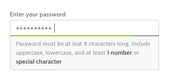
Password validation
The password requirements are a special kind of live hint. The requirements are displayed semibold and will turn to regular when the user fulfilled that requirement. Simultaneously the gray separator will turn green with every step (fulfilled requirement).

Page specific error validation
This validation concerns a whole section, form or even a whole view and is mainly used to show errors when the sending the data to the server.
<form class="dt-form">
  <dt-form-field>
    <dt-label>Name</dt-label>
    <input type="text" dtInput placeholder="Example name" />
  </dt-form-field>
  <dt-form-field>
    <dt-label>Value</dt-label>
    <input type="text" dtInput placeholder="12345" />
  </dt-form-field>
  <dt-form-field>
    <dt-label>Domain</dt-label>
    <input type="text" dtInput placeholder="example.com" />
  </dt-form-field>
  <div class="dt-button-wrapper">
    <button dt-button variant="secondary">Cancel</button>
    <button dt-button>Submit</button>
  </div>
  <dt-alert severity="error"
    >The connection to the server failed. Please try again later.</dt-alert
  >
</form>
Use the alert component for this use case. You can find more information about the styling and position of this component on the alert component page.