This guideline describes the Dynatrace navigation pattern, the information flow and distribution and page hierarchies. The navigation pattern creates consistency in information structure, layouts and design. This allows users to become familiar with views and product structure.
Types of views
In Dynatrace there are basically 5 types of views (amongst some exceptions like the installer views):
- Dashboard (DB),
- List view (LV),
- Detail view (DV),
- Analysis view (AV),
- Settings views (SV)

Dashboard (DB)

The dashboard is a standalone view containing summaries of all possible list and detail views. It lives outside the typical view hierarchy and only contains cross-links.
List view (LV)
For example list of hosts, list of services, list of applications, list of synthetic monitors, ...

The basic list views are created to list all entities from one type. From a list view, users are able to drill down to detailed views. Note: List views are always directly connected to detail views.
Detail view (DV)
For example the detailed views of Applications, hosts, Cloud Foundry etc.
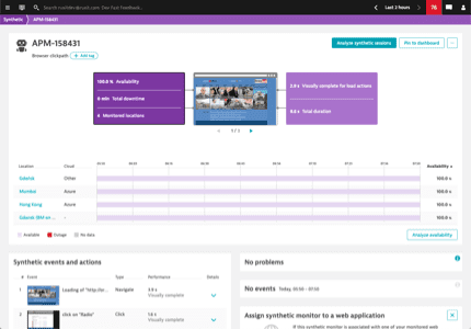
Detail views are showing a summary of all components and use cases of one entity (usually grouped in cards. From a detail view it is possible to drill down to list views again, which would then show a list of logical children of the entity.
All views available as a drill down or deeper analysis from a details view are visible in the in-page navigation within the header of a details view. View the page header cluster component implementation to see the behavior. Despite that, cross-linking enables users to analyze entities from a different perspective (e.g. view a host in smartscape). Whenever it is possible to cross-link an entity to an analysis view the context is taken along. For example when linking from a host view to the smartscape view, users can look at this particular host on smartscape and will see which other entities communicate with it. Cross-linking without taking the context along should be avoided at all times.
Analysis view (AV)
For example service flow, smartscape, resource waterfall, process to process connection analysis, ...

Sometimes there is a deeper analysis necessary which is accessible from a detail view. Analysis views are designed for a specific purpose therefore flexible in their structure.
Settings views (SV)
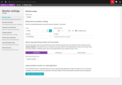
Settings views exist globally as well as specifically for the individual entities. Read more about the view structure in the settings page pattern.
Navigation menus
Users can navigate to entity list views via the global navigation. The first layer of list views is visible in this global navigation menu (burger menu). In some cases also analysis views can be part of this layer with the purpose of showing every entity from a different point of view.

Info bubbling
Like the little bubbles in your Soda, information in Dynatrace bubbles from the bottom to the top in the view hierarchy. In this process it gets summarized and distilled. That way, when drilling down, information becomes richer and richer.

High level information (~2% information) is visible for users on their dashboards. This can be the entry point to a detail view containing the information within the infographic (~5% information) on top and/or a summary of the specific topic (~25% information) on a card with a drilldown button. The drilldown button leads then to the full amount of information on a dedicated analysis view (100% information).
An example: A user has pinned the resources of his web application's user action "Loading of page /checkout.jsf" on his dashboard as a tile to monitor if there's something unusual (~2%). This tile drills down to the details view of the user action where the top health metrics show a brief summary of the overall resources available (~5%). Users can now see more information to the resource loadings in the dedicated resource card with the contributors breakdown (~25%) and if necessary they can drill down from there to the waterfall analysis (100%) which allows focusing on the loadings of each individual resource.
Construction of entity views
Navigation on entity views
The structure of an entity view can be compared to a book index. There is always only one level 1 headline <h1> (page title) and each chapter would be a level 2 headline <h2> in Dynatrace which is presented on a dedicated card. That way we create structured content that is semantically correct, human-readable, machine-readable and accessible.
Wait, what? ...it's almost like the internet was made for this!

An example for this would be the Cloud Foundry details view. Users can see only one level 1 headline <h1> on top in the page header. All cards are covering either a use case, a single component this entity exists of or a perspective to analyse this foundation from (e.g. from a usage perspective - the memory and CPU this Cloud Foundry foundation is currently consuming).

Elements on entity views
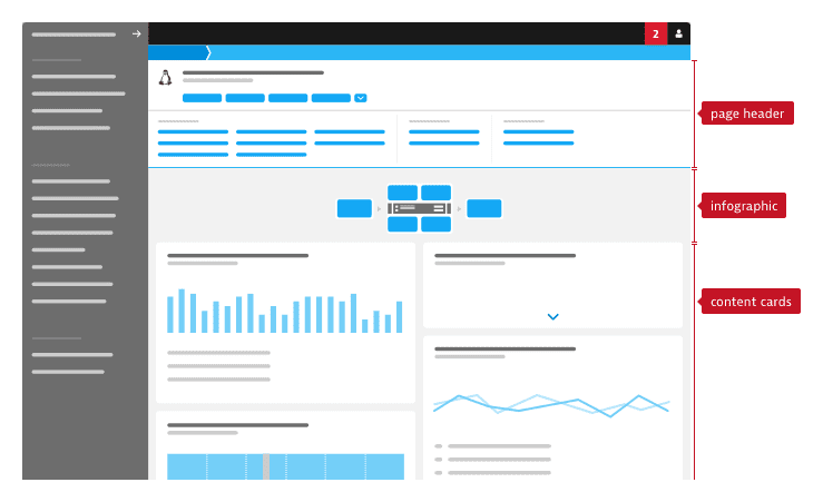
Page header
The page header is a consistent place to find the h1 (title) of a view and can contain the in-page navigation if needed. The in-page navigation consists of an expandable menu with up to 4 dedicated buttons as quick links. This expandable menu contains a long list of links, on click users can scroll down to the specific part of a screen. The list of links enables our users to get an overview of what is covered within a view in Dynatrace and at the same time users have a short cut to analyse this topic. However all possible links to logical children, specific analysis views or cross-links of the entity are also part of the menu. Therefore users always know which analysis they can drive from a specific entity, where they can drill into more details and what they can actually find on this page.
On scroll, the page header gets minimized, so that it takes up less space and let the user concentrate on the content. View the page header cluster component implementation to see the styling and behavior.
Infographic
Infographics are used as health summary on top of all cards. They show a flow, how an entity functions, what is calling an entity and what entities are called. Additionally they are used as a shortcut to more information about specific aspects of an entity. Clicking one part of the infographic should scroll down to a card showing more details and (if necessary) provide a drilldown to analyze the specific topic.
Content cards
Cards are used to group elements together. Within an entity view a card shows either
- the summary of logical children of this entity (e.g. all processes running on a host or all user action of a web application)
- represents a use case
- or shows a perspective of the entity
The priority of cards raises to the top. Please read more about the card component and its usage.