Common UI styles describe all necessary aspects, rules and fundamental elements that define our components. In case no valid component exists for a specific use case, these elements are the basis to create new UI components.
Welcome to the 4px grid
We are using a 4px grid for our product UI. Therefore every component, every spacing between components or sections has to fit the grid.

Border radius
In case an interactive element has a border radius, it should be consistent throughout the product.
border-radius: 3px
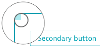
Interaction color
Interactive components on light background contain elements with our interaction color $turquoise-600.
Turquoise 600
Focus state
All interactive components use the default focus state, specified by the browser. Therefore the appearance of the focus state may vary from browser to browser.
Icon sizes
The icon sizes used in our product are:
- XS: 16px
- S: 20px (default)
- M: 32px
- L: 44px
- XL: 64px
16px icons

16px icons are used in components.
20px icons
 The default icon size is
 20px. They are used in table columns, in the menu bar, in infographics, etc.
32px icons

32px icons are used in tiles and often in list views.
44px icons
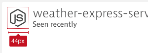
44px icons are used in combination with the headline within a [card]({{link_to_id id='card' }}).
64px icons
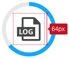
64px icons are used in progress circles.