Breadcrumbs are used to navigate and to indicate the currently viewed page. Our breadcrumbs are hierarchy-based, which means that every item of the breadcrumb represents a page and thus also the path that led up to the currenty visited page.
<dt-breadcrumbs aria-label="Breadcrumbs navigation">
  <a dtBreadcrumbsItem href="first">First view</a>
  <a dtBreadcrumbsItem href="first/second"> Second view </a>
  <a dtBreadcrumbsItem href="first/second/third"> Third view </a>
  <a dtBreadcrumbsItem>Current view</a>
</dt-breadcrumbs>
Imports
You have to import the DtBreadcrumbsModule when you want to use the
dt-breadcrumbs.
@NgModule({
  imports: [DtBreadcrumbsModule],
})
class MyModule {}
Initialization
The dt-breadcrumbs component accepts a color property to define the color
version of the breadcrumbs. Anchor elements with the dtBreadcrumbsItem
directive applied can be used as breadcrumbs items.
Inputs
| Name | Type | Default | Description |
|---|---|---|---|
color |
'main' | 'error' | 'neutral' |
main |
Current variation of the theme color which is applied to the color of the breadcrumbs. |
aria-label |
string |
undefined |
Takes precedence as the element's text alternative. |
To make our components accessible it is obligatory to provide either an
aria-label or aria-labelledby.
Behavior
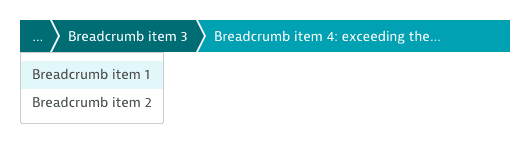
Items within a breadcrumb have a maximum length. To ensure that unusually long items do not take up too much space, their text value will be abbreviated using an ellipsis as soon as the maximum length is exceeded.

Should there not be enough space in the component to show all items, individual
items are grouped together (starting from the left) and can be accessed by
clicking the ... item in the breadcrumb.
Theming
Breadcrumbs always have the theme color of the current page the user is visiting. If the page does not have a theme color (e.g. in the settings), then the breadcrumbs will be displayed in gray.
<dt-breadcrumbs [color]="color" aria-label="Breadcrumbs navigation">
  <a dtBreadcrumbsItem href="first">First view</a>
  <a dtBreadcrumbsItem href="first/second"> Second view </a>
  <a dtBreadcrumbsItem>Current view</a>
</dt-breadcrumbs>
<dt-button-group
  [value]="color"
  (valueChange)="changed($event)"
  style="margin-top: 16px"
>
  <dt-button-group-item value="main">main</dt-button-group-item>
  <dt-button-group-item value="error">error</dt-button-group-item>
  <dt-button-group-item value="neutral">neutral</dt-button-group-item>
</dt-button-group>
Breadcrumb in use
Listening to an observable
Content within the breadcrumb can change.
<dt-breadcrumbs aria-label="Breadcrumbs navigation">
  <!-- data$ emits a new items list after each 5 seconds -->
  <a dtBreadcrumbsItem *ngFor="let item of data$ | async" [href]="item.href">
    {{ item.label }}
  </a>
</dt-breadcrumbs>
Dark
Breadcrumbs also work on dark background.
<div class="dt-example-dark" dtTheme=":dark">
  <dt-breadcrumbs aria-label="Breadcrumbs navigation">
    <a dtBreadcrumbsItem href="first">First view</a>
    <a dtBreadcrumbsItem href="first/second"> Second view </a>
    <a dtBreadcrumbsItem>Current view</a>
  </dt-breadcrumbs>
</div>